In times of economic turmoil, it’s helpful to know that there is a long-term stock market indicator that can help us make better retirement income decisions. Numerous economic factors can inform retirement income decisions, but none has been discussed more than the cyclically-adjusted price-earnings ratio (CAPE), a long-term measure of how much investors are willing to pay for corporate earnings.1 This ratio plummeted during the recent stock market drawdown. But historical evidence shows that as CAPE goes down the percentage that a retiree has been able to withdraw from his or her portfolio has gone up. Let’s review this evidence and see what it may mean for today’s retirement investors.
CAPE’s Historical Relationship to Retirement Income
Retirement is a long-term event. CAPE is a long-term indicator. So, it’s not surprising that CAPE has a lot to say about retirement income. The box plot in Figure 1 shows the historical distribution of available 20-year portfolio withdrawal percentages,2 grouped by initial CAPE value, since 1881. (The “boxes” show the middle 50% of data. The “whiskers” show the lowest and highest 25%.)
Figure 1
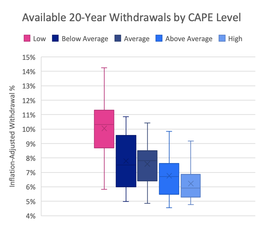
CAPE levels (divided into historical quintiles): Low – CAPE between 4.6 and 11.2; Below Average – 11.2 to 14.8; Average – 14.8 to 17.8; Above Average – 17.8 to 22.2; High – 22.2 to 44.8.
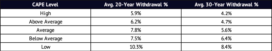
The high-level pattern is clear.3 When CAPE was low, available withdrawal percentages were high. When CAPE was high, much lower withdrawal rates were possible. The same is true for 30-year withdrawal periods.4
CAPE’s Historical Relationship to Retirement Nest Eggs
This pattern might tempt us to think that high CAPEs are bad for retirement income. But the story isn’t quite that simple. When CAPE is high, portfolio balances tend to be high as well. And we don’t spend percentages – we spend dollars. The average available withdrawal rate in high-CAPE periods was 43% lower than in low-CAPE times. But those high-CAPE periods were at the tail end of some of the best stock markets in history. Figure 2 shows how much money a hypothetical retiree would have had at retirement (in 2020 dollars) if, prior to retirement, they had saved $1000/month for 30 years in a 60/40 portfolio.
Figure 2
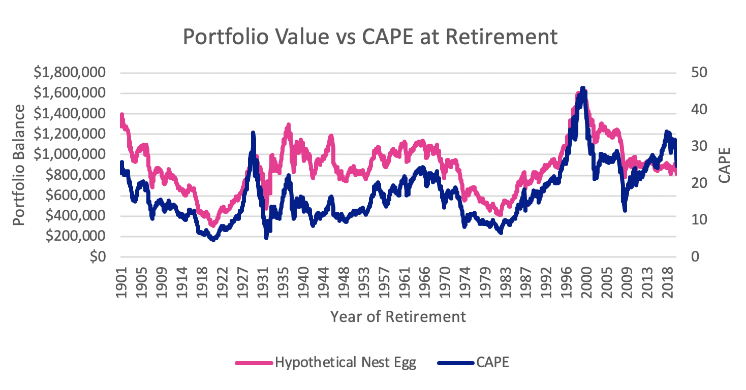
The lesson is that high CAPEs are also high points for retirement nest eggs. The best time in history to retire wasn’t a point when the highest withdrawal rate was possible, but a time when a healthy withdrawal rate could have been applied to a large portfolio.
CAPE and Retirement Income Risk
Figure 1 holds a few more lessons for retirement income planning. For example, it suggests that the predictive power of CAPE is highest when CAPE is high. The range of withdrawal percentages available during periods of high CAPE is the smallest of any CAPE regime. This is true for both the total range (from the minimum to the maximum, between the ends of the “whiskers”) and for the middle 50% (the box, called the interquartile range).
Importantly, the lower tail of the withdrawal distribution (the lower whisker, which is the range from the lowest available withdrawal rate to the 25th percentile) and the range from the median to the 25th percentile (the bottom half of the box) are also smallest in high-CAPE periods. This means that the risk of severely overestimating available retirement withdrawals has been lowest when CAPE was highest. Overestimating sustainable withdrawal rates is the primary risk that can lead to unwanted downward income adjustments in retirement, so it is comforting to know that this risk is lowest when CAPE is highest.
High-CAPE periods are on the other extreme. The range between the lowest and highest withdrawal rates in low-CAPE periods is massive. Thankfully, rates were also substantially higher than they were in other CAPE regimes: the lowest withdrawal rate in history during a low-CAPE period was roughly equal to the average rate in high-CAPE periods, and two-thirds of the available withdrawal range in low-CAPE times lies above the highest high-CAPE withdrawal rate. So, high CAPE means high withdrawals rates but also higher risk of overestimating available withdrawals.

What’s CAPE Been Up to Lately?
Now that we know a bit about historical patterns, let’s look at how CAPE has behaved recently. Since 1881, average (median) CAPE is 16.3. But in the last 30 years CAPE has been consistently higher, with an average of 26.0. The February-March 2020 stock market drawdown brought about the largest drop in CAPE since the Great Recession.
Figure 3

Viewed across 140 years of history, the March 2020 low point is still an “above average” CAPE. However, we hadn’t seen CAPE this low since 2012, during the long recovery from the Great Recession. And this reduced CAPE value was just above the lowest levels we saw in the worst of the protracted Tech Bubble crash (2000-2003).5
The economic repercussions of the COVID-19 pandemic are still developing, so only with hindsight will we know whether this was the low point for CAPE in this market cycle. But we do know that in the past, as CAPE goes down, the pain retirees may have felt in their investment portfolio has been eased somewhat by an increase in the withdrawal percentage they could afford to take from those portfolios. We also know that, no matter the CAPE value, CAPE can help us make better retirement income decisions.
1. Traditional P/E ratios divide price by recently reported or projected earnings. But these earnings numbers are volatile, and the resulting measure isn’t very good at helping us develop expectations about future returns. CAPE, on the other hand, uses long-term (usually 10-year) average inflation-adjusted earnings and is much more useful for developing long-term expectations.
2. These withdrawal levels estimate how much of an initial portfolio balance a retiree could have withdrawn annually from a 60/40 stock/bond portfolio, with adjustments for inflation thereafter, for 20 years. Research suggests that a static approach to retirement income produces poor outcomes, but this approach is useful for comparing possible retirement income levels across historical periods. Past performance does not guarantee future results. Results based on index returns. The returns of actual investments may be higher or lower than index returns. Results would differ based on different investment mixes and retirement income plans.
3. There are many potential confounding factors when trying to interpret CAPE data. For example, accounting rules for earnings calculations have changed over time, meaning the denominator for the CAPE ratio is not consistent at all points of history. Changes in dividend/share buyback behavior and the supply of and demand for stocks may also have affected the expected numerator of the ratio over time.
4. It is common in retirement research to focus on 30-year retirement periods. We focus on 20-year periods in Figure 1 in order to increase the number of periods in our data set that represent high CAPE values. (Many of these high-CAPE periods have occurred recently, making them out-of-sample when looking at 30-year retirement periods.)
5. As of this writing (April 17, 2020) CAPE had recovered to 27.4, just above the 30-year average, but stock markets remained volatile.