
 When trying to decide how much someone can afford to spend in retirement, we often worry about poor investment returns early in retirement. Poor returns early in retirement can permanently limit retirement income. Researchers call this Sequence of Returns Risk.
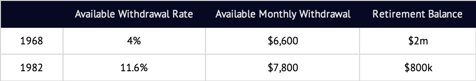
Historically, the difference between good and bad return sequences appears huge. For example, if you retired in December 1968, just before a rough period of high inflation and poor market performance, you could have taken 4% of your initial portfolio in the first year, with later withdrawals adjusted for inflation, for 30 years.1 In contrast, if you retired in August 1982, at the beginning of a roaring bull market, the same portfolio would have supported a withdrawal rate of about 11.6% – nearly three times as much. This stark difference is usually taken to be evidence for the magnitude of Sequence of Returns Risk.
But these numbers are wrong – or at least grossly misleading. We spend dollars, not percentages. A 1982 retiree would have been able to withdraw three times the dollars available to the 1968 retiree only if both retirees had the same amount of money at retirement. But, assuming identical savings behavior prior to retirement, that is impossible.
Let’s walk through a more “reality-based” example.
Assume that both people saved $1000/month and retired after 40 years. In this case, the 1968 retiree could have spent about $6600/month. The 1982 retiree could have spent $7800/month – an advantage of 18%. That’s not even close to the 300% we expected. Where did all the extra income go?
The answer is that these two retirees had very different investment experiences while they were saving, and so had very different amounts of money when they retired. Both saved a total of $480,000 over 40 years, but the 1982 retiree had about $800,000 at retirement, compared to the 1968 retiree’s roughly $2 million. The extra dollars for the 1968 retiree erase a large portion of the expected income gap.
This pattern shows us that, in the past, those who experienced great returns in their saving years and had a large nest egg at retirement were able to spend less, as a percentage of their retirement portfolios, than others. Conversely, those who experienced worse returns and had smaller retirement nest eggs than others tended to be able to spend more in percentage terms.
The examples of 1968 and 1982 demonstrate that this effect can go a long way toward cancelling out what might otherwise have been dramatic differences. Sequence of returns risk is real, and we ignore it at our peril. But for those who save and invest for retirement over time, this risk is smaller than you may have heard.3 We have market cycles to thank (or blame) for this pattern: historically, what goes up tends to go down. But thankfully, what goes down has also gone up again.
1.This is the source of the well-known “4% rule”. All examples here assume a 60/40 stock/bond portfolio, are stated in approximate real (inflation-adjusted) dollar terms and reflect gross index returns of S&P 500 stock index and the Ibbotson SBBI Intermediate Term Government Bond Index and the DMS US Bond TR Index. Indices are not available for direct investment. Actual investments may have provided better or worse results. Past performance is not a guarantee of future results.
2. With this saving behavior, the worst time to retire was August 1918 and the best time was December 1954.
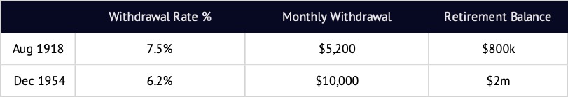
That’s still a substantial difference in real dollars, but nothing close to the 300% statistic we started with. Notice that the percent income available in the best time is lower (6.2%) than that found in the worst time (7.5%). This is the final proof that percentage withdrawal rate, on its own, doesn’t tell us much about retirement income.
3. For this example, the coefficient of variation (CV, calculated as standard deviation / mean) of percentage withdrawal rate is 27% while the CV of dollars of real income is 18%.